Fashion
Orlando Pirates’ New Third Jersey Brings Soweto Street Energy to the Pitch

Orlando Pirates have stepped away from the familiar black and white this season, but not from their roots. During their Carling Knockout clash against Magesi, the Buccaneers surprised fans by unveiling a limited-edition third jersey that blends the spirit of Soweto’s streets with the sharp edge of modern football design.
The shirt, produced in partnership with adidas, draws its pulse from the famous Orlando Towers. Those giant murals that dominate the township skyline aren’t just landmarks. They are symbols of local creativity and pride. That same energy runs through the jersey’s design: textured patterns, soft pastel tones, and detailing that shifts under light. Depending on where you stand, the colour reads as a pale blue or muted lilac, subtle yet instantly distinctive.

Orlando Pirates – Instagram
Adidas describes the design as a tribute to “the art of the streets,” and you can see why. The club crest, with its skull and crossbones, sits cleanly against a backdrop that feels more like a lifestyle piece than a standard match kit. It is the kind of shirt that looks just as good with jeans as it does under stadium floodlights.
When the team walked out wearing it, reactions were immediate. Some supporters called it the freshest look Pirates have had in years. Others weren’t sure how to feel about such a break from tradition. Still, the buzz was undeniable. Social feeds filled with clips and comments: excitement, curiosity, and a fair bit of envy from rival fans.

Orlando Pirates – Instagram
The decision to make it a limited drop adds to the hype. Official sales begin on 14 November through adidas stores, select retailers, and the club’s online shop. Quantities are expected to be tight, and if recent trends are anything to go by, resale prices may soar once it sells out.
For Orlando Pirates, this isn’t just about fashion. It is about representing where they come from and showing that the culture of football in South Africa extends beyond match day. The Orlando Towers connection grounds the design in real community identity. It is local pride stitched into fabric.

Orlando Pirates – Instagram
More than anything, the jersey reflects how football culture is evolving. Kits are no longer only for players. They have become part of how fans express themselves. From Johannesburg streets to Cape Town hangouts, supporters are wearing their club colours like everyday fashion. Pirates and adidas clearly know their audience: young, stylish, and proud of where they come from.
So, whether you are heading to Orlando Stadium or catching the game from home, this new kit is hard to ignore. It is a confident step into modern football design, bold enough to stand out yet grounded enough to feel authentic.
Because sometimes, the best way to honour tradition is to remix it.


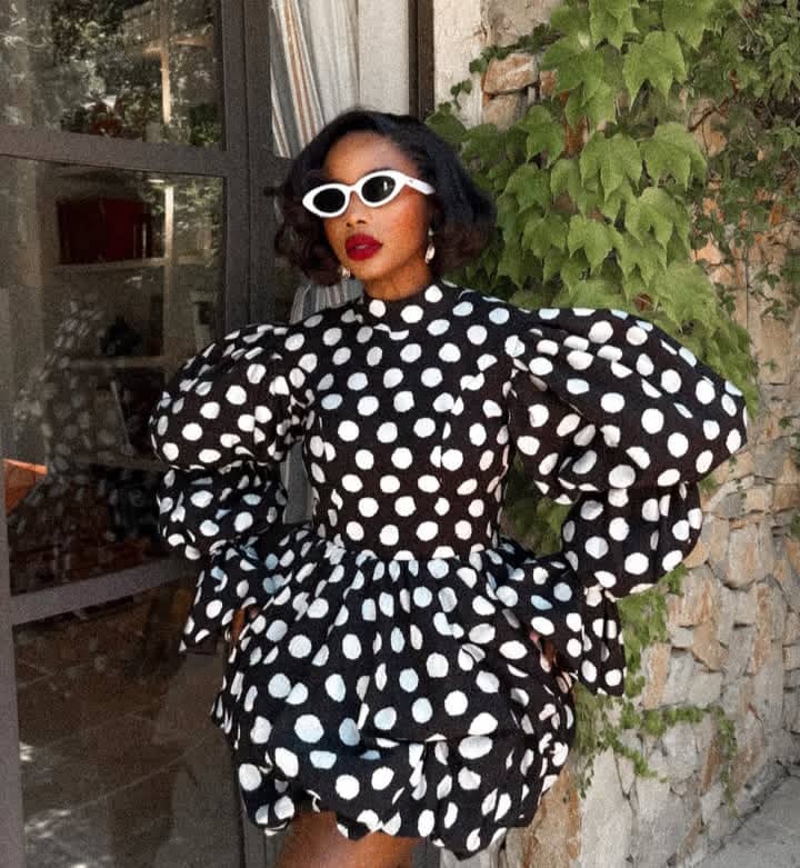
Polka dots are enjoying a strong comeback this year, with designers reworking the classic print through sculptural shapes and modern tailoring. Instead of leaning into vintage-inspired dressing, the focus has shifted to bold proportions and clean styling.
Pamela Mtanga‘s latest outfit reflects that direction.
The television presenter wore an oversized white polka dots dress, choosing a design that balanced volume with structure. The high neckline gave the dress a refined look, while the fitted bodice defined her waist before flowing into a bubble hem. One of the defining details was the exaggerated puff sleeves, which brought volume and balanced the fitted bodice.
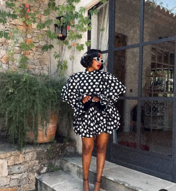
Photo: Instagram/@Pamelamtanga
She kept to black and white, pairing the dress with delicate black ankle-strap heels. A compact black handbag with a textured finish tied everything together.
She kept her accessories minimal. White oval sunglasses picked up the white tones in the polka dot print, while drop earrings introduced a subtle finishing touch that kept the focus on the dress.
She wore her hair in a softly curled bob with a side part, a hairstyle that suited the dress’s dramatic sleeves. Her makeup included fresh-looking skin, softly defined eyes and a rich red lipstick, introducing the only bold shade in the look.
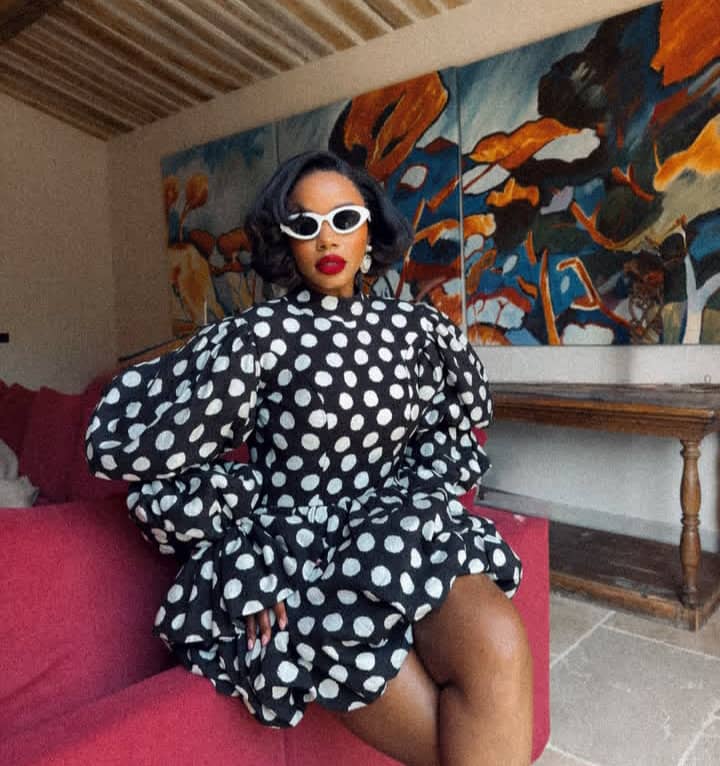
Photo: Instagram/@Pamelamtanga
Instead of adding statement jewellery or colourful accessories, Pamela kept the styling understated. The simple accessories keep the focus on the dress.
The look also reflects Pamela Mtanga’s signature style. She often wears structured tailoring, dramatic sleeves and contemporary dresses paired with understated accessories. This polka dot look fits naturally alongside many of her previous fashion choices, reflecting her preference for bold shapes paired with carefully chosen accessories.

Mihlali Ndamase is embracing classic tailoring with a pinstripe outfit that pairs structured tailoring with relaxed proportions. The beauty entrepreneur and content creator opted for a black-and-white look centred on tailored pieces, showing another side of her wardrobe beyond the glamorous occasionwear she is often seen wearing.

Mihlali Ndamase – Instagram
The outfit centres on a black pinstripe three-piece set with wide-leg trousers and a fitted halterneck waistcoat. Fine white pinstripes contrast against the black fabric, while the close-fitting waistcoat sits neatly through the torso before meeting the loose-fitting trousers. Instead of wearing the waistcoat on its own, Mihlali layered it over a crisp white button-down shirt with an exaggerated curved hem extending below the waistcoat, creating a striking black-and-white combination.

Mihlali Ndamase – Instagram
The oversized trousers fall loosely over her silver platform heels, emphasising the relaxed fit of the outfit. The mix of tailored pinstripes and wide-leg trousers offers a modern interpretation of classic suiting while maintaining a structured shape.
She paired the outfit with metallic silver accessories, including a quilted top-handle handbag and matching platform peep-toe heels. A silver wristwatch, stud earrings and stacked rings rounded off the look.
Mihlali wore her hair in a centre-part style pulled neatly behind her shoulders. Her makeup included sculpted brows, defined lashes, neutral eyeshadow, softly contoured cheeks and a nude lip that complemented the black-and-white look.

Mihlali Ndamase – Instagram
This outfit reflects a style direction Mihlali has returned to several times over the years. While she is often associated with body-skimming dresses, corsetry and statement eveningwear, she has also incorporated sharp tailoring into her wardrobe. Compared with some of her more embellished red-carpet appearances, this pinstripe look places greater emphasis on tailoring while staying true to the refined style that regularly appears in her fashion choices.
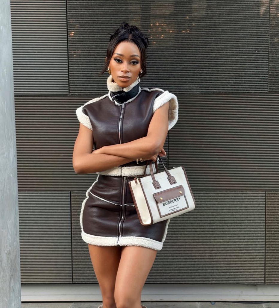
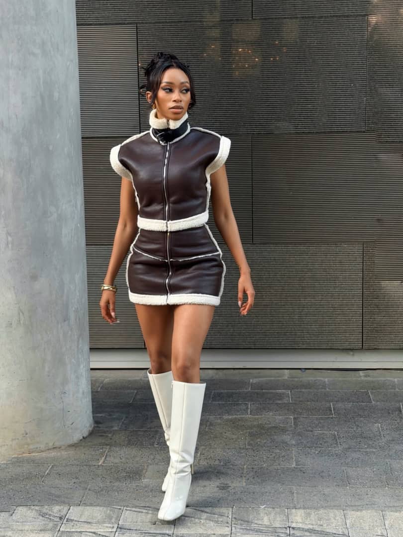
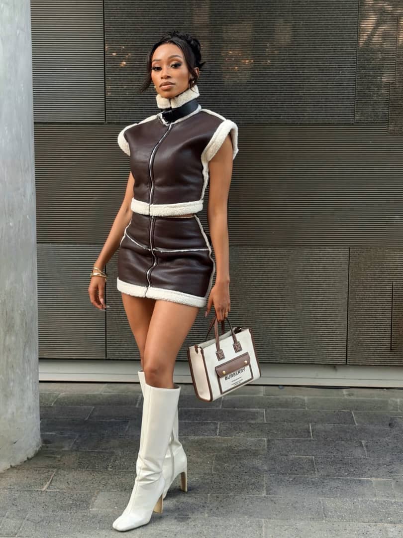
Thabsie is embracing winter dressing with a coordinated faux leather look. In a recent Instagram post, the South African singer tagged Fashion Nova and identified her outfit as the Along The Lines Sherpa Faux Leather Skirt Set, putting the spotlight on a coordinated look that blends classic winter textures with a fitted cut.
The two-piece is crafted from chocolate-brown faux leather and finished with cream sherpa trim throughout. The cropped sleeveless top has a high funnel neck, a full-length front zip and structured cap sleeves lined with sherpa. Matching trim runs along the hem, creating a clear contrast against the dark faux leather.
Thabsie – Instagram
The coordinating mini skirt follows the same details as the top. Designed with a high waist, it has a front zip running through the centre and sherpa trim along the hem. The matching zips on both pieces create a consistent finish, while the fitted cut gives the set a structured appearance. The rich brown faux leather paired with the cream sherpa trim gives the outfit an aviator-inspired feel, making it well suited to the winter season.
Thabsie – Instagram
Thabsie kept her accessories within the same brown and cream tones. She carried a structured white Burberry tote with brown leather handles and trim, complementing the shades of the outfit. She paired the look with knee-high white boots with square toes and block heels, creating a bold contrast against the dark faux leather. She also wore slim gold bangles on one wrist.
Her hair was styled in a relaxed updo with soft face-framing strands, while her makeup included defined brows, softly blended eye makeup, warm neutral tones and a nude lip.
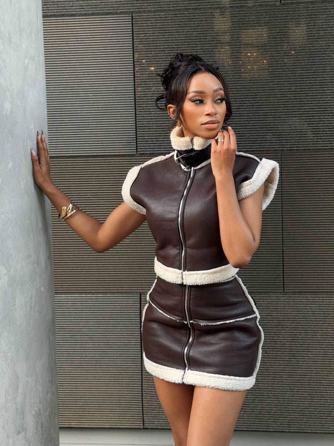
Thabsie – Instagram
The look reflects a style Thabsie has returned to in recent months. From tailored outfits to coordinated neutral looks and leather pieces, she has consistently favoured structured designs with a refined finish. This sherpa-trimmed faux leather co-ord continues that approach, reflecting her preference for coordinated dressing while adapting it for the colder season.


Constantly Tired? Your Liver Could Be Telling You Something

Jonasi From ‘The Polygamist’ Inspires Makhadzi’s Latest Track

Women Are Being Ghosted by Their Long-Term Boyfriends Now


-

 Movies3 months ago
Bontle Modiselle, Bobby van Jaarsveld and Chad Jones Bring South African Presence to “Michael” Premiere in Berlin
-

 Movies3 months ago
Buntu Petse Joins “Inimba” Season 2
-

 Celebrity News3 months ago
Charlize Theron Opens Up About Childhood Trauma and Mother’s Act of Self-Defence
-
 Events3 months ago
Miss South Africa Qhawekazi Mazaleni and First Runner-up Luyanda Zuma to Host at the Metro FM Music Awards
-

 Top Shows3 months ago
Top Billing Returns for Its Long-Awaited Season 3
-

 Beauty3 months ago
5 Best Budget Makeup Brands to Shop in South Africa
-

 TV3 months ago
Sinemivuyo Mpulu Joins ‘Top Billing’: How the TikTok Creator Earned His Place
-

 Sex & Relashionships3 months ago
Making Love Work When Your Significant Other Still Lives With Their Parents